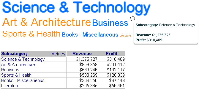
A Data Cloud widget displays attribute elements in various sizes to depict the differences in metric values among the elements. This type of widget is similar to a Heat Map widget because they both allow an analyst to quickly identify the most significant positive or negative contributions.
A Data Cloud widget displays a list of attribute elements. The first metric on the Grid/Graph determines the font size for the attribute elements. A bigger font for an element indicates a larger metric value. You can hover over each subcategory to view its metric values.
Related topics