In the Derived Elements Editor, select a derived element.
At the top of the Derived Elements
Editor, click the format icon  .
The Format dialog box opens.
.
The Format dialog box opens.
Determine whether to format the attribute elements or the metric values for each attribute element:
To format the headers, select Headers from the drop-down menu.
To format the values, select Values from the drop-down menu.
Format font
On the Font tab, format the font using the following options:
Font: Select any font that is installed and available on your machine.
Style: Apply italic and bold effects to the text.
Size: Select any font size that is installed and available on your machine. Choices in this list vary depending on the selected font type.
Effects: Apply an underline or strikeout effects to the control.
Color: Specify a color in which to display the text by clicking the arrow on the color menu and selecting a color.
Access additional colors by clicking the More Colors button.
The formatting that you apply is shown in the Sample section of the Font tab.Format numbers
On the Numbers tab, select one of the following options:
Default: Numbers are displayed using the default number formatting for the attribute element.
General: Numbers have no specific formatting.
Fixed: Specify the number of decimal places to be displayed as well as how to display negative numbers.
Currency: Specify the number of decimal places to be displayed, the currency symbol to be used, where to display the currency symbol, and how to display negative numbers.
Date: Numbers are displayed as dates. Specify the format to display dates in by selecting one of the examples in the Type field.
Time: Specify the format to display time in by selecting one of the examples in the Type field.
Percentage: Specify the number of decimal places to be displayed and how to display negative numbers.
Fraction: Displays decimals as fractions. Specify the format to display fractions in by selecting one of the examples in the Type field.
Scientific: Displays numbers in scientific notation. Specify the number of decimals to be displayed.
Custom: Specify a custom notation to display numbers in.
Format alignment
On the alignment tab, format the alignment of the text, text wrapping, text direction, and cell padding using the following options:
Text alignment: specifies the horizontal and vertical alignment of text in a cell.
Horizontal: Specify the horizontal alignment as General, Left, Center, Right, or Fill. You can choose to keep the default alignment instead.
Note: If the width of the cell is longer than the data in it and if you select the Fill option for horizontal alignment, the data is repeated in the cell until the cell is filled. For example, if the data in a cell is $39.00 and you select the Fill option for horizontal alignment, the data in the cell is repeated, displaying as $39.00$39.00$39.00. In MicroStrategy Web, filled cells display as centered in MicroStrategy Web due to the absence of a fill display capability in HTML.Vertical: Specify the vertical alignment as Top, Center, or Bottom. You can choose to keep the default alignment instead.
Text control:
Wrap text: Select Yes to display the text on multiple lines within the cell; select No to display the text on a single line. You can choose to keep the default text wrap instead.
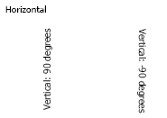
Text direction: Specify whether the text is displayed Horizontally (across the page), 90 degrees (vertically from bottom to top ), -90 degrees (vertically from top to bottom), as shown below:
Note: Vertical text is displayed when the report is executed in MicroStrategy Web. Vertical text is not displayed in Desktop or in Design Mode in MicroStrategy Web.Padding: Adds space between the text and the border of the cell.
Left: Enter the amount of padding between the text and the left border of the cell.
Right: Enter the amount of padding between the text and the right border of the cell.
Top: Enter the amount of padding between the text and the top of the cell.
Bottom: Enter the amount of padding between the text and the bottom of the cell.
Format color and lines
On the Color and Lines tab, format the color and lines using the following options:
Fill: Select a color from the drop-down menu to fill the background of the cells.
Borders: Select the style and borders for each cell.
None: No border applied.
All: The same line style and color is applied to the left, right, top and bottom of the cell. Specify the style and color for the borders.
Custom: A different line style and color can be applied to the left, right, top, or bottom of the cell. Specify the line style and color for each line.
Flash-only: These formatting options are only available for Flash-enabled documents. These options are not available in reports or non-Flash documents:
Style: Select the style for the border from the drop-down menu.
Color: Select the color for the border from the drop-down menu.
Weight: Determines the thickness of the lines that make up the border. Select the weight from the drop-down menu.
Apply the changes
Click OK. The Format dialog box closes.
Click OK. The Derived Elements Editor closes.