Once you create a Map widget for the iPhone or iPad, you can show relationships between locations on the map when the widget is displayed on an iPhone or iPad. To do this, you display lines between the map markers. You can choose to display these lines using different thicknesses or colors depending on the relationship between locations.
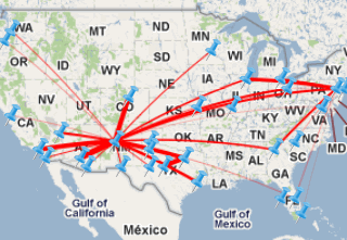
For example, in the image below, a series of airports is displayed in a widget. The flights between the airports are displayed as lines, with thick lines representing flights with many passengers, and thin lines representing flights with few passengers.
To display lines between markers in a Map widget in a document, you must provide a total of two Grid/Graphs, as follows:
A Grid/Graph used to display the Map widget: This Grid/Graph contains the attributes and metrics used to display the map markers in the widget. For more information on the requirements for this Grid/Graph, see Creating a Map widget for the iPhone or iPad.
A Grid/Graph used to display lines in the widget: This includes the metrics used to determine the color and thickness of lines between map markers, and attributes containing the IDs of the starting and ending locations of each line. The IDs provided must correspond to the IDs used to identify map marker locations in the first Grid/Graph. Steps are below to create this Grid/Graph.
This procedure assumes that you have already created a document containing a Map widget. This document should contain a Grid/Graph used to display the Map widget, which contains the attributes and metrics used to display the map markers in the widget. For detailed steps to add a Map widget to a document, see Creating a Map widget for the iPhone or iPad.
Open the document in Design or Editable Mode.
Right-click the Grid/Graph used to display the Map widget, then select Properties and Formatting. The Properties and Formatting dialog box is displayed.
From the left, click Advanced, then clear the Enable incremental fetch on grid check box.
Click OK to save your changes.
From the Insert menu, point to Grid/Graph.
Click the location on your document in which you want to place the Grid/Graph. This Grid/Graph will not be visible when the widget is displayed on the iPhone or iPad, and should be in the same document section as the Grid/Graph used to display the Map widget.
From the Dataset Objects panel on the left, select attributes and metrics, and drag them on top of the Grid/Graph, as described below.
You must place a total of two attributes on the rows of the Grid/Graph, which provide the IDs of the starting and ending locations of each line in the widget. The IDs provided must correspond to the ID forms in the attribute used to identify map marker locations in the first Grid/Graph. Place the attributes as follows:
The first attribute is the lookup attribute for the widget. It must provide a single attribute form containing the ID of the starting location for each line.
The second attribute must provide a single attribute form containing the ID of the ending location for each line.
Place at least one metric on the Grid/Graph's columns:
The
first metric is used to automatically determine the thickness of each
line displayed in the widget based on the value of the metric, with thick
lines representing large metric values. For example, if airports are displayed
in the Map widget, and the lines represent flights between each airport,
you can add the Passenger Count metric to the Grid/Graph. When the widget
is displayed on an iPhone or iPad, the flights with the most passengers
are displayed with thick lines, while flights with less passengers are
displayed with thin lines.
Note: You can provide a metric with a constant value
to display each line using the same thickness.
The
second metric is used to determine the color of each line in the widget.
By default, each line in the widget is displayed using the default color.
You can override the default color by defining a threshold to change the
font color of the metric values that meet the threshold condition.
In the example above, you can add the Flight Delay metric to
the Grid/Graph, then define a threshold on the metric to display flight
delays of 30 minutes or more in red, and flight delays of less than 30
minutes in green. When the widget is displayed on an iPhone or iPad, the
lines representing flights are colored red for delays of 30 minutes or
more, and green for delays of less than 30 minutes.
For more information on defining a threshold on a metric, see
Creating a conditional
format using complex conditions.
Note: If only one metric is placed on the columns, all
lines will displayed using the same default color.
The ID attribute form of each attribute should be displayed in the Grid/Graph you just created. If you provided the location of each map marker in the Map widget using attribute forms, the Latitude, Longitude, and ID attribute forms of the location attribute should be displayed in the Grid/Graph used to display the Map widget. If they are not displayed, for each attribute, right-click the header of the attribute, point to Attribute Forms, then select the attribute forms you want to display.
If you provided the location of each map marker in the Map widget using attributes, you must include the lookup attribute on both the Grid/Graph of the Map widget, and the Grid/Graph that you just created to display lines between the map markers. Place the lookup attribute on the rows of the Map widget's Grid/Graph, directly before or directly after the attributes providing the latitude and longitude of each map marker.
Right-click the Grid/Graph of the Map widget, then select Properties and Formatting. The Properties and Formatting dialog box is displayed.
From the left, click Advanced.
Clear the Enable incremental fetch on grid check box, then click Apply.
From the left, select Widget.
Click the Widget
Properties icon  . The Map Properties dialog box opens.
To enable the display of lines, select the Display Affinity Lines/Arcs check box.
If the Use Attribute or Form option is set to Use Attribute, from the Select Lookup Attribute drop-down list, select the lookup attribute.
From the Select Affinity Data drop-down list, select the Grid/Graph you created using these steps.
From the Draw Arcs/Lines drop-down list, select one of the following:
To display the lines as curved, select Arcs. The arcs are displayed based on the shortest distance between two points on the Earth.
To display the lines as straight, select Lines.
From the Max Line Thickness drop-down list, select the maximum thickness that can be used to display lines in the widget. The thickness of each line is automatically determined based on the value of the first metric on the new Grid/Graph's rows. You can specify a maximum thickness of 8. The default value is 5.
Click OK to return to the Properties and Formatting dialog box.
Click OK to save changes and return to the document.
Related topic