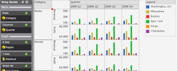
A Graph Matrix visualization allows you to view your data in a chart containing multiple graphs. A designer can create the visualization to display the data in different graph styles. In the example below, the designer chose the vertical bar graph style.
The table below contains example images of each graph style available for a Graph Matrix visualization.
|
Graph Style |
Description |
Example Image |
|
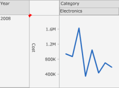
Line |
You can display your data as a vertical or horizontal line graph, to view lines representing metric values for each element of an attribute. |
|
|
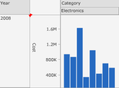
Bar |
You can display your data as a vertical or horizontal bar graph, to view bars representing metric values for each element of an attribute. |
|
|
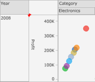
Scatter |
You can display a scatter plot that allows you to visualize the trends of two different metrics for a set of attribute elements. In the scatter plot:
|
|
|
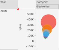
Bubble |
You can display a bubble plot that allows you to visualize the trends of three different metrics for a set of attribute elements. In the bubble plot:
|
|
|
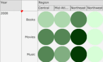
Grid |
You can use the Grid style to identify trends across combinations of
data. Each marker in the grid can be automatically sized or colored based
on the value of a metric. |
|
You can click on graph elements (such as lines, bar risers, or bubbles) to drill up or down and examine your data at the level of a specific attribute element, or filter the data to display only the graph elements you are interested in.
You can drill on data in the following ways:
You can drill on a scatter or bubble graph to display only the data for the graph elements you choose, then break the data by a selected attribute. For example, a scatter graph contains profit data across several regions. If you select the bubbles for the Northeast and Central regions, then drill to Call Center, profit data for each call center in the Northeast and Central regions is displayed.
When you
drill on a vertical line graph, a vertical bar graph, or grid, you can
display only data for the graph elements you choose, then display your
data in a separate graph column for each attribute element on the horizontal
axis.
For example, a vertical bar graph contains profit margin data across
several years. If you select the bars for 2010 and 2011, then drill to
Category, profit margin data for each Category is displayed, and a graph
is displayed in a separate column for 2010 and 2011.
When you
drill on a horizontal line graph or a horizontal bar graph, you can display
only data for the graph elements you choose, then display your data in
a separate graph row for each attribute element on the vertical axis.
For example, a horizontal bar graph contains profit margin data across
several years. If you select the bars for 2010 and 2011, then drill to
Category, profit margin data for each Category is displayed, and a graph
is displayed in a separate row for 2010 and 2011.
Separate steps are below to drill on or filter data in a Graph Matrix visualization.
You must have the Web Visual Insight and Execute Document or Analysis privileges.
Click the name of the analysis to run it.
Do one of the following:
Click a graph element in the visualization to select it. You can select multiple graph elements in the Graph Matrix visualization by pressing CTRL, then click additional elements to select them. Click the arrow icon displayed at the top of your selection to display a list of options.
Click and drag over an area of the visualization to choose all the graph elements in a selected area. Click the arrow icon displayed at the top of the selected area to display a list of options.
From the context menu, select the object you want to drill to. For example, to drill to the data at the Category level, select Drill to Category.
You must have the Web Visual Insight and Execute Document or Analysis privileges.
Click the name of the analysis to run it.
Do one of the following:
Click a graph element in the visualization to select it. You can select multiple graph elements in the Graph Matrix visualization by pressing CTRL, then click additional elements to select them. Click the arrow icon displayed at the top of your selection to display a list of options.
Click and drag over an area of the visualization to choose all the graph elements in a selected area. Click the arrow icon displayed at the top of the selected area to display a list of options.
From the context menu, select one of the following:
To display only the graph elements you have selected and remove all other elements from the visualization, select Keep Only.
To display all graph elements in the visualization except the elements you have selected, select Exclude.
Related topics